An Aspen home receives a thoroughly modern update, giving it both welcome functionality and striking style
By Linda Hayes | Photo: Pat Sudmeier | December 30, 2015
It began with a simple enough concept. Transform a traditional 1980s home in east Aspen to better suit the lifestyle of its internationally based owner. What resulted, however, is not just a renovation, but an architectural gem that incorporates ample natural light and flexible, practical spaces.
“The pieces of the original house were in the right place, but it was cramped and dark, with small windows that didn’t take advantage of the views up Independence Pass,” explains Keith Howie, a principal of Poss Architecture + Planning and chief designer and project architect on the job. “Our task was to update it and open it up to give it the right exposure and allow it to be used for a multitude of functions.”
Exteriorwise, the home needed to remain consistent with its surroundings and comply with the neighborhood’s homeowners’ association. To that end, Howie kept the palette simple and incorporated sustainable materials such as reclaimed mahogany and Colorado buff limestone. Roof forms, adjusted at certain points, were finished with standing-seam metal. An entry stairway was accented with a custom stainless-steel rail with mahogany caps, while terraces and other outdoor living areas were enclosed with glass walls and covered by a trellis system designed for aesthetics as well for as natural shading and cooling.
Inside the 6,791-square-foot residence, the programming took on another scope entirely. In addition to revising the floor plan to increase its functionality, particularly as a backdrop to significant artwork, Howie designed an undulating central stairway reminiscent of the outdoor stairs. “We changed the stairs to help bring light into the center of the house and to connect all three levels,” he says. “It’s an important organizing element.”
Early in the planning stages, Houston-based interior designer Martha Finger—who had worked on another of the client’s U.S. homes—was brought in to partner with the architectural team on finishes and furnishings. The collaborative, whirlwind design process included monthly visits to Aspen as well as trips to New York, Houston, Dallas and Paris in search of just the right piece or artisan to create it. The hunt included talking with gallery owners, foraging at art fairs and just plain
brainstorming ideas.
Intensely personalized, the resulting interiors are nothing short of spectacular. “Some designers have a stamped look of what they want,” says Finger, who describes herself as a chameleon. “I have an open mind. I work closely with each client to help bring out what they’re envisioning. I always reinvent the wheel.”
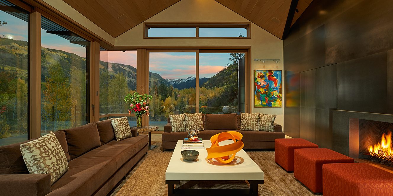
Take the main level, for instance. The owner wished to use contemporary yet warm materials that would work with the planes of the wood in the rift-cut white oak ceiling. The solution was to import 1,440 square feet of 18th century reclaimed Bars de Montpellier stone for the flooring. The kitchen (“minimal yet functional,” says Finger) features a custom-designed Italian Boffi cabinet system that combines glossy and matte finishes. A main feature in the living room is a multipaneled patina-black steel wall designed by Howie and built in Mexico City by Segundo Pérez, who traveled to Aspen to take measurements to ensure a perfect fit.
The master bedroom includes a custom storage unit, with a hidden closet door, constructed of patterned melamine that resembles charred wood. A similar unit in the master bath offsets Italian Carrera marble-paneled walls that appear as one continuous slab. “They’re like pieces of architecture,” Howie says.
Everywhere, color and texture were key. A sculptural orange Herve Leger light in the entry inspired pops of color throughout the home, including a trio of poufs upholstered with Hermès fabric in the living room. Similar hues appear in the fabrics chosen for chair cushions in impromptu seating areas and bunk-room bedding, for example.
While the home is most commonly used by the owner alone (or with her significant other), it was uniquely designed to accommodate extended family and friends as well. “It has dual functionality,” notes Howie. “We consolidated elements so that when the owner is there by herself, it functions as an apartment on one level with an office above; when the family comes, they stay on the lower level, which has a suite of three bedrooms and a media room. It works well for everyone.”
An enlarged outdoor area with an elongated fire pit and endless views extends the home’s living and entertaining space. “In Aspen houses in general, it’s really important to have a transition area that can be used in the spring and fall when temperatures are cooler,” says Howie. “We like creating those type of spaces. This is the perfect climate for it.”
Reflecting on the finished project, which took almost nine months to design and more than two years to build, Finger recalls the owner’s reaction. “When the trucks arrived from Houston, where all the furnishings had been stored, and everything was installed, she was in tears. She said, ‘It’s how I dreamed it would look.’ It was very emotional.”
Howie concurs. “I think the house has increased the amount of time the owner spends here. She enjoys it more and entertains more. To take a house that was basically dark and cut up, and be able to transform it into a house that really changes the way someone lives, is one of the most rewarding feelings.”
DESIGN DETAILS
Architecture
Keith Howie, Poss Architecture + Planning
970.925.4755
Contractor
Structural Associates
970.945.0147
Interior Design
Martha Finger, Martha Baxter Interior Design
713.256.4135
Woodwork
Genesis Hospitality Corporation
970.635.9315
Limestone
Chateau Domingue
713.961.3444
This article is featured in MODERN LUXURY:
http://modernluxury.com/aspen/story/open-season

