MODERN ELEMENTS TRANSFORM A HOME NEAR ASPEN TO SHOWCASE A HOUSTON COUPLES ART COLLECTION
By Kimberly Olson | March 2017
“It was the opposite of what we were looking for,” a Houston homeowner says of the offbeat house near Aspen she and her husband considered when searching for a vacation home—they were hoping to find something spacious with plenty of bedrooms that was in move-in condition. “We didn’t want something that needed work, and this house needed a lot,” the wife recalls. But they were quickly won over by its ideal location and quirky charms. “The house needed refreshing,” the wife says of the 1970s structure, “but it was very much ahead of its time.” The couple, who are passionate art collectors, felt an immediate connection with the seller, a local artist who had shared the home with his wife. So house keys changed hands, from artist to art collectors.
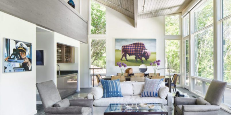
To carry out the refresh, the couple assembled a talented team that included architect Jamie L. Brewster McLeod; their longtime designer and close friend, Houston-based Terry Prather; and builder Shane Evans. With its good bones and opportunities for knockout views, Brewster McLeod could see the structure’s potential, but the main living space had a low sloping ceiling and short sliding doors. “One of the biggest changes was raising the roof in the living room,” she says. Brewster McLeod doubled the room’s height, gave it a butterfly roof and added large windows to display views of the Maroon Bells and Aspen Highlands. “That was fairly transformative,” Evans says. “It had a tremendous impact on not only the architecture from the outside of the house but the view plane as well.”
House Details
- Style: Contemporary
- Photography: David Patterson
- Architecture: Jamie L. Brewster McLeod, Brewster McLeod Architects
- Interior Design: Terry Prather, Terry Prather Interior Design & Architecture
- Home Builder: Shane Evans, Structural Associates
- Landscape Architecture: Chad Thomson, TLC Inc.
To complement the room’s newly open feel, the original rock replace was also reimagined. “It needed a more modern façade,” says Brewster McLeod, who worked with structural engineer Stephen Peightal of S K Peightal Engineers on realizing the new board-form concrete design. The sleek replace and expansive sight lines “became the main focus of the house,” Prather says.
Other changes in the house were driven by the couple’s art collection. Brewster McLeod transformed the home’s tight spiral staircase into a spacious open stairwell, which allows 12 large prints by Yinka Shonibare to hang along the walls uninterrupted from the first floor to the second. “We needed to make the staircase match the modern updates we were making throughout the house,” the architect says. “There are no risers—only treads—and a glass railing so you can see the artwork.” That glass railing, as Evans explains, allows natural light to filter into both levels.
When it came to furnishing the updated spaces, functionality and durability were priorities. “We wanted all of the surfaces to be simple—easy to clean and care for,” the wife says. Prather kept that notion, as well as the couple’s love for entertaining, in mind. The designer created two sitting areas in the living room by placing four swivel chairs in front of the new fireplace and then appointed a second grouping with a sofa and two Donghia chairs. “This breaks up the long room and creates different conversation areas,” Prather says. The Donghia chairs, along with an Eames chair in the master bedroom, belonged to the previous owners. “They were classic pieces,” Prather says. “We changed the leather on the Eames chair to give it a lighter look and upholstered the Donghia chairs with leather.”
The lighter look continues with a muted palette throughout the house. “The art is very colorful, so we didn’t want a lot of conflicting color in the furniture,” Prather explains. Natural materials such as wood, leather, linen and mohair add rich visual texture. One notable exception is a pair of vivid orange chairs in the bunk room, which was previously used as an artist studio. Now, multiple bunk beds fit into the recesses of the room—perfect for the couple’s three children and their visiting friends—and Prather lined the walls with Cole & Son’s Woods wallpaper. “It feels like you’re in a tree house, as it juts out into the landscape,” the designer says.
The scenery outside was given an update as well. Landscape designer Chad Thomson used natural river boulders to terrace a new backyard and side yard and added plenty of new plantings. “The wife wanted a lot of color, and she likes pinks, white and purples,” he says. “So we used Pinky Winky hydrangeas, lilacs and Munstead lavender.” A whimsical bear sculpture by artist Tony Tasset inspired the front garden. “The bear has wild eyes,” says Thomson, who brought the garden “into the bear’s world” by using plantings of different heights and lots of color.
In the end, the home got a fresh face while retaining its original artful spirit. “The biggest goal was trying to stay true to the house and enhance what was already there while providing a new modern home,” Brewster McLeod says. “We kept it simple and elegant and focused on bringing in more light and views.” Combined with the couple’s art collection, those elements produce a house that’s tailored to the homeowners’ lifestyle. “The art is serious art, but a lot of it is humorous,” the wife says. “The house feels very light and very embracing to us. It’s just a happy place.”

